
 NBA
NBA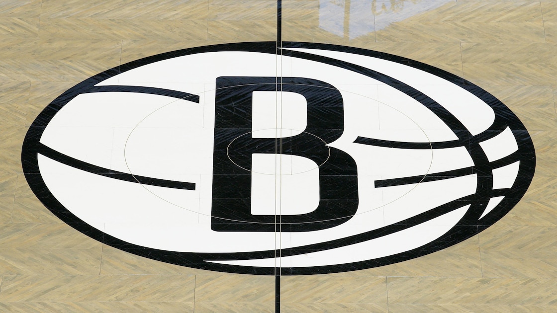
The Brooklyn Nets reached into the archive this week and came back with something clean. Really clean. Bleacher Report revealed the franchise’s new ABA-inspired Classic Edition uniforms and matching court design ahead of the 2026-27 season, and the reaction landed fast. Nostalgia usually walks a fine line in the NBA. Too safe and it feels like a merch drop. Too loud and it starts looking like a costume. Brooklyn hit the middle lane with confidence.
The look revives the spirit of the old New York Nets era while sharpening it for the current NBA aesthetic. The franchise leaned fully into the ABA roots instead of treating them like a side note. That matters in a city where identity gets challenged every season. The Nets have spent years trying to define themselves between borough cool, superstar drama, roster resets, and constant reinvention. This rollout felt more grounded than that. Cleaner. Less manufactured.
And the court? Different energy entirely.
The visuals carried weight because they tapped into something the modern league understands better than ever: presentation moves culture. Uniforms are no longer background noise in the NBA calendar. They become social media currency before opening night even arrives. Alternate courts get dissected like playoff rotations. Fans build emotional attachment through visuals long before a team proves itself in the standings. Brooklyn clearly knows that.
The timing also feels intentional. The Nets are entering another season with questions hovering over the franchise trajectory, and this kind of launch creates a bridge between eras without forcing fake nostalgia. It tells fans the organization still values history even while the roster picture continues evolving. NBA teams sell hope every October. Brooklyn sold continuity.
Short version: this was not a lazy throwback.
The ABA influence carries its own gravity in basketball history. Bright styling. Street-level swagger. A little edge around the game. The league’s fingerprints still show up all over today’s NBA, from pace to personality to the entertainment-first atmosphere surrounding big games. By leaning into that lineage, the Nets tapped into a version of basketball culture that still feels alive. Not museum-piece history. Living history.
The visual rollout itself mattered too. Bleacher Report highlighted the new uniforms and court through polished videos and photos rather than a standard press-release dump, and that approach fits how NBA branding works now. Fans do not experience jersey reveals through static images anymore. They experience them through cinematic lighting, tunnel-shot aesthetics, quick-cut edits, and social reaction cycles. Brooklyn treated the reveal like a moment instead of an obligation.
That part counts.
Because image still drives conversation around this league as much as any preseason depth chart.
The Nets also avoided the trap some franchises fall into with retro projects. They did not overload the design with modern gimmicks trying too hard to look futuristic. The restraint helped. The throwback influence remained recognizable without looking dated, and the updated presentation gave it enough sharpness to fit inside today’s NBA visual ecosystem. Fans can picture these uniforms under arena lights immediately. That is usually the test.
There is also a business angle humming underneath all of this, even if teams rarely say it outright. Classic Edition drops create fresh emotional buy-in during the long runway before games start counting. They reconnect older fans while giving younger fans something aesthetically distinct to latch onto. In a league built on visibility, jersey culture has become part of competitive relevance. The teams winning online attention before opening night often stay in the conversation longer once the season begins.
Brooklyn understands the assignment there. The franchise has spent years balancing minimalist branding with New York basketball ambition. These uniforms finally feel like a blend of both instead of choosing one side. The ABA callback injects personality without losing the sleek identity the Nets have pushed since moving to Brooklyn.
And honestly, the timing could not be cleaner.
The NBA preseason calendar is crowded every October with training-camp soundbites, roster battles, and endless speculation cycles. A visual reveal this strong cuts through the noise instantly. Fans may not remember every preseason quote by next week. They will remember the court. They will remember the colors. They will remember whether a jersey looked cold on arrival.
Brooklyn got that part right.
Looking Ahead: The next step is seeing how the full presentation translates on game night once the lights come on and the building fills up. Uniform reveals can spark attention. Winning keeps them alive. But for one week at least, the Nets controlled the aesthetic conversation across the league without playing a single meaningful minute. In the NBA, that still counts for something.